Plumwood M
Project Framing
Plumwood M operates in the space between craft and commerce. They produce artisan material goods—objects you hold, surfaces you touch—and needed a digital presence that could carry some of that tactile quality through a screen. The challenge was fundamental: how do you make a website feel material when the medium is inherently immaterial?
The scope included brand identity refinement, a responsive website, and a set of digital guidelines that would let the Plumwood M team maintain visual consistency across future touchpoints. We were working alongside their existing brand direction rather than replacing it, which meant finding a way to translate physical-world qualities into digital patterns without losing the essence.

Challenge and Design Context
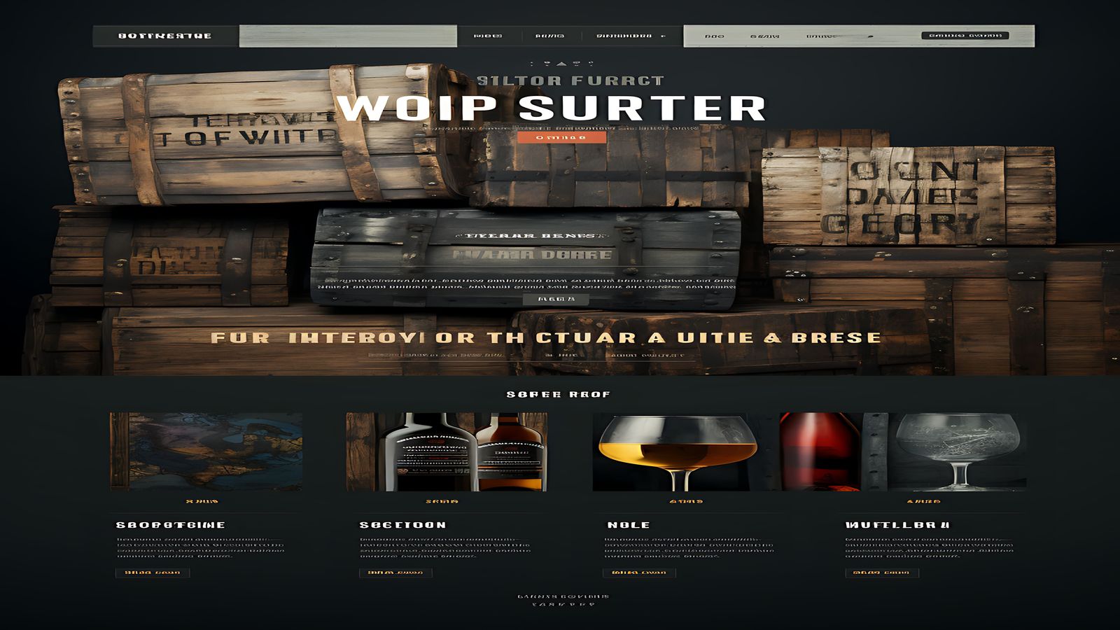
Craft brands face a particular digital problem. Their products communicate quality through weight, texture, finish, and the subtle imperfections that mark handmade work. None of those qualities translate directly to CSS and HTML. The usual workaround is high-resolution photography with lifestyle staging, but that approach leans heavily on image assets and can feel generic when the photography follows predictable patterns.
We wanted to find a middle ground—a digital design language that nodded to the material qualities of the work without depending entirely on photography to do the heavy lifting. The design system itself needed to carry some of the brand's textural character.
The other challenge was audience. Plumwood M sells to designers, architects, and specifiers who evaluate material choices professionally. The website needed to function as a reference tool as much as a brand showcase. Product specifications, finish options, sample ordering, and technical documentation all needed to coexist with the editorial brand content.
Structure and Layout Decisions
We structured the site around two primary user journeys. The first is the brand experience path—homepage, about, philosophy, process documentation—which reads like an editorial magazine. The second is the product reference path—material categories, individual product pages, specification sheets, sample requests—which functions more like a structured catalogue.
These two paths share a common design language but diverge in layout density. Brand pages use generous whitespace, oversized imagery, and editorial pacing. Product pages use a tighter grid with specification tables, swatch grids, and compact detail views. The transition between the two modes is gradual rather than abrupt, so the site feels cohesive even though different sections serve very different purposes.
The navigation accommodates both journeys with a two-tier structure: primary brand sections in the main bar, and product-specific navigation in a secondary contextual menu that appears on product-related pages.

Typography and Visual Language
The type system for Plumwood M uses a pair that contrasts geometric precision with organic softness. The display face has slightly rounded terminals and irregular stroke widths that hint at hand-drawn origins without being literally handwritten. Body text uses a clean contemporary serif with generous letter-spacing, giving long descriptions the readability they need without competing with the display type.
Colour operates in a tight range. The base palette draws from natural material tones—warm stone, deep charcoal, muted clay. There is no bright accent colour. Interactive states use a subtle warmth shift rather than a colour change, so that links and buttons feel integrated into the page rather than overlaid on it.
The most distinctive visual element is a system of thin rules and alignment markers that appear at section transitions. These lines reference the precision of material specification drawings while also serving as functional page-structure indicators. On hover, some of these rules extend or shift slightly, creating a barely perceptible sense of movement that rewards attention without demanding it.
Interaction and Implementation Notes
The build prioritised image performance, since the site is heavily photographic. We implemented a multi-stage image loading strategy: low-resolution blurred placeholders render instantly, then high-resolution images fade in as they load. The transition uses a subtle opacity animation rather than a hard swap, which avoids the flash that instant replacement causes.
Product pages include a material swatch interaction where users can toggle between finish options for a given product. Rather than loading separate images for each finish, we use a single base photograph with CSS filter adjustments that approximate different material tones. It is not a perfect representation—nothing replaces seeing the real material—but it gives specifiers a fast way to narrow options before ordering physical samples.
The specification tables use a responsive pattern that converts from a standard table on desktop to a definition-list format on mobile. Each specification row becomes a labelled value pair that stacks vertically, maintaining readability without forcing horizontal scrolling.
Lessons and Observations
Plumwood M reinforced how much design attitude can be carried by typography and spacing alone, even before photography enters the picture. During the early design phases, we presented layouts with placeholder image blocks, and the pages still felt distinctly Plumwood M because the type system and spatial rhythm did so much work. That is a useful test for any brand-heavy project: does the design hold up without its images?
The dual-journey structure also taught us about managing visual density transitions. Sites that need to be both editorial and functional often fail because the two modes feel disconnected. The solution was not a single compromise layout but two related layout systems that share enough DNA to feel unified while diverging enough to serve their different purposes well.
Working with a craft brand also meant accepting that some qualities simply cannot be digitised. The website can communicate intention, context, and aesthetic direction, but it cannot replace the experience of handling a material sample. Designing with that constraint in mind kept us honest about what the interface could and should try to achieve.
Related Work
Interested in working together?
We are always open to conversations about new projects.
Start a project