Tom's
Project Framing
Tom's is a food brand with deep roots in physical retail—farmers markets, specialty stores, direct relationships with customers who recognise the packaging before they read the label. The move to direct-to-consumer online sales was overdue but carried a specific risk: losing the warmth and personality that made the brand distinctive in the first place.
Our role was to design and build an e-commerce experience that could translate in-person brand qualities into a digital storefront. This meant more than putting products in a grid with an add-to-cart button. It meant finding digital equivalents for the sensory experience of browsing a specialty food shop—the colours, the textures, the sense of care and curation that make you trust what you are buying.

Challenge and Design Context
Food e-commerce sits in one of the most competitive and template-dominated spaces online. Most food brands launching online reach for a Shopify theme, swap in their brand colours, and call it done. The result is functional but interchangeable—you could swap the logo and product photography and the site would work equally well for any other food brand. That interchangeability is a trust problem. When everything looks the same, nothing feels considered.
Tom's needed a store that felt bespoke without requiring bespoke maintenance overhead. The team is small and not technically oriented. Whatever we built had to be manageable by people who would update products, seasonal offerings, and editorial content without touching code.
Photography was a significant constraint. The existing product photography was shot for packaging and wholesale catalogues—clean, well-lit, but generic. We needed to work within that asset library while finding design treatments that added warmth and context.
Structure and Layout Decisions
The site structure follows a linear commerce flow—storefront, collection, product, cart, checkout—but each step has editorial qualities layered in. The homepage opens with a full-width seasonal feature rather than a product grid, immediately distinguishing it from catalogue-first stores. Below the feature, curated collections replace the standard category grid, each with a short editorial introduction that gives context to the grouping.
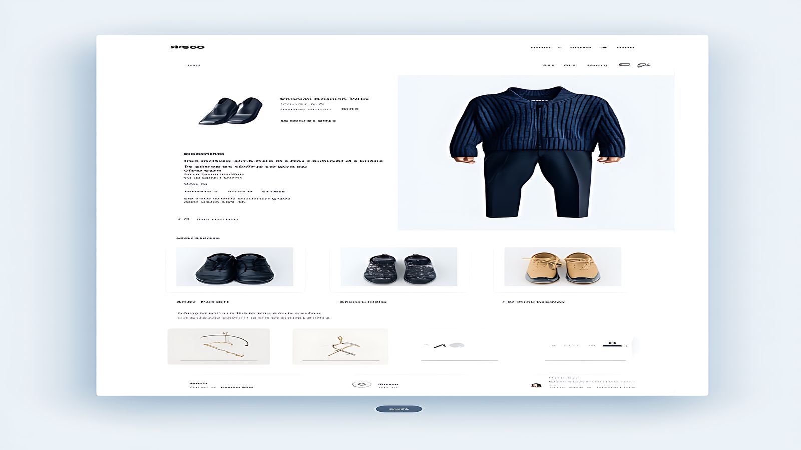
Product pages use a split layout. The left column holds the product image gallery, and the right column contains the product details, pricing, and purchase controls. Below the fold, a full-width section presents preparation suggestions, sourcing notes, and ingredient details in an editorial format. This transforms the product page from a transactional endpoint into a content experience that gives the customer reasons to trust the product before they buy it.
The cart uses a slide-in panel rather than a dedicated page. This keeps the user in their browsing context and reduces the friction of adding items. The panel shows a running total, item count, and a clear path to checkout without requiring a full page transition.
Collection pages use a flexible grid that varies row density based on product count. Small collections display in generous two-column layouts with larger imagery. Larger collections tighten to three or four columns. This prevents the common problem where a collection with three items looks sparse and a collection with thirty looks overwhelming, even though both use the same underlying grid.

Typography and Visual Language
The type system balances heritage and modernity. The display face has a warm, slightly rounded character that references hand-lettering traditions without being literally handwritten. Body text uses a readable contemporary serif that performs well at both descriptive paragraph length and the short label sizes that product interfaces require.
The colour palette extends from the physical packaging—earth tones, warm neutrals, and a single deep accent colour used for pricing and calls to action. We avoided the temptation to introduce additional accent colours for seasonal campaigns, instead using photography and editorial layout to create visual variety within the fixed palette.
Product cards have a distinctive visual treatment: a thin border with generous internal padding and a subtle background tint that shifts on hover. The hover state does not enlarge the card or apply a shadow effect—it just warms the background slightly, which is enough to communicate interactivity without adding visual noise to the grid.
Interaction and Implementation Notes
The front-end build uses a headless architecture connecting to the existing commerce platform's API. Product data, inventory, and order management stay in the platform. The presentation layer is a custom front-end that fetches data at build time for catalogue pages and at request time for dynamic elements like cart state and inventory availability.
Page transitions use a coordinated fade that prevents the jarring hard-cut between pages that static sites often produce. The transition is brief—200 milliseconds—and uses opacity rather than positional movement, so it reads as a smooth refresh rather than a dramatic animation.
Image handling was critical. Product images load with blur-up placeholder treatment and maintain consistent aspect ratios across the grid. We enforced a single crop ratio for all primary product images, which required re-cropping a significant portion of the existing asset library but resulted in a vastly more cohesive grid presentation.
Lessons and Observations
Tom's confirmed that e-commerce experiences benefit enormously from editorial design thinking. The most effective online stores are not pure catalogues—they are curated experiences that give customers context, confidence, and a reason to browse rather than just search for a specific item.
The project also demonstrated the value of constraining a colour palette. By refusing to introduce new colours for sales events or seasonal features, we forced the design to use layout, photography, and typography to create visual variety. The result is a storefront that feels consistently on-brand regardless of what is being promoted.
Finally, Tom's reinforced something that applies to most commerce design: the gap between functional and delightful is smaller than it appears. Adding a thoughtful hover state, an editorial introduction to a collection, or a preparation note to a product page does not require significantly more development effort, but it transforms the user's perception of the brand behind the store.
Related Work
Interested in working together?
We are always open to conversations about new projects.
Start a project